Overview
I led the redesign of Revolver's website as creative director, directing two designers and a developer. We replaced a dense, ad-heavy interface with a clean, white-dominant layout that puts the photography and the writing first.
The design is still in use eight years later.
The problem
Revolver's site had grown cluttered. Pages carried a heavy ad load and layered modules, and the typography leaned on generic "rock" styling. Together they made one of metal's most respected magazines look less serious than its journalism.
The approach
- Reduce. I stripped the page back to a clean white canvas with a single gold accent for the nav rule, the dek and the byline.
- Set the type. I chose bold, clean headline faces to give the magazine a confident voice that doesn't depend on genre cliche. The serif body type keeps long reads comfortable.
- Unify. One article template carries across stories, video and mobile, so the experience stays consistent on every screen.
The design
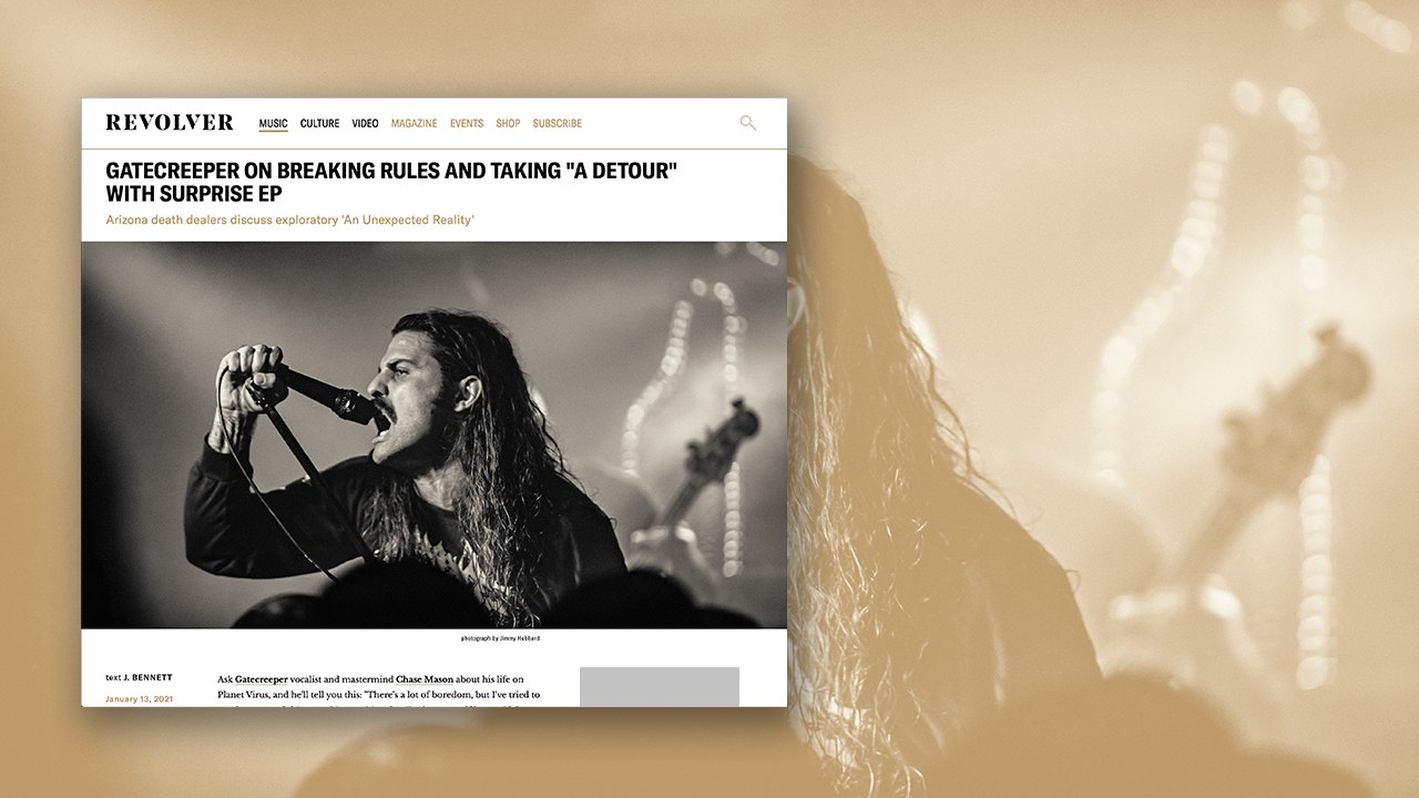
Article page — headline, dek and photography lead
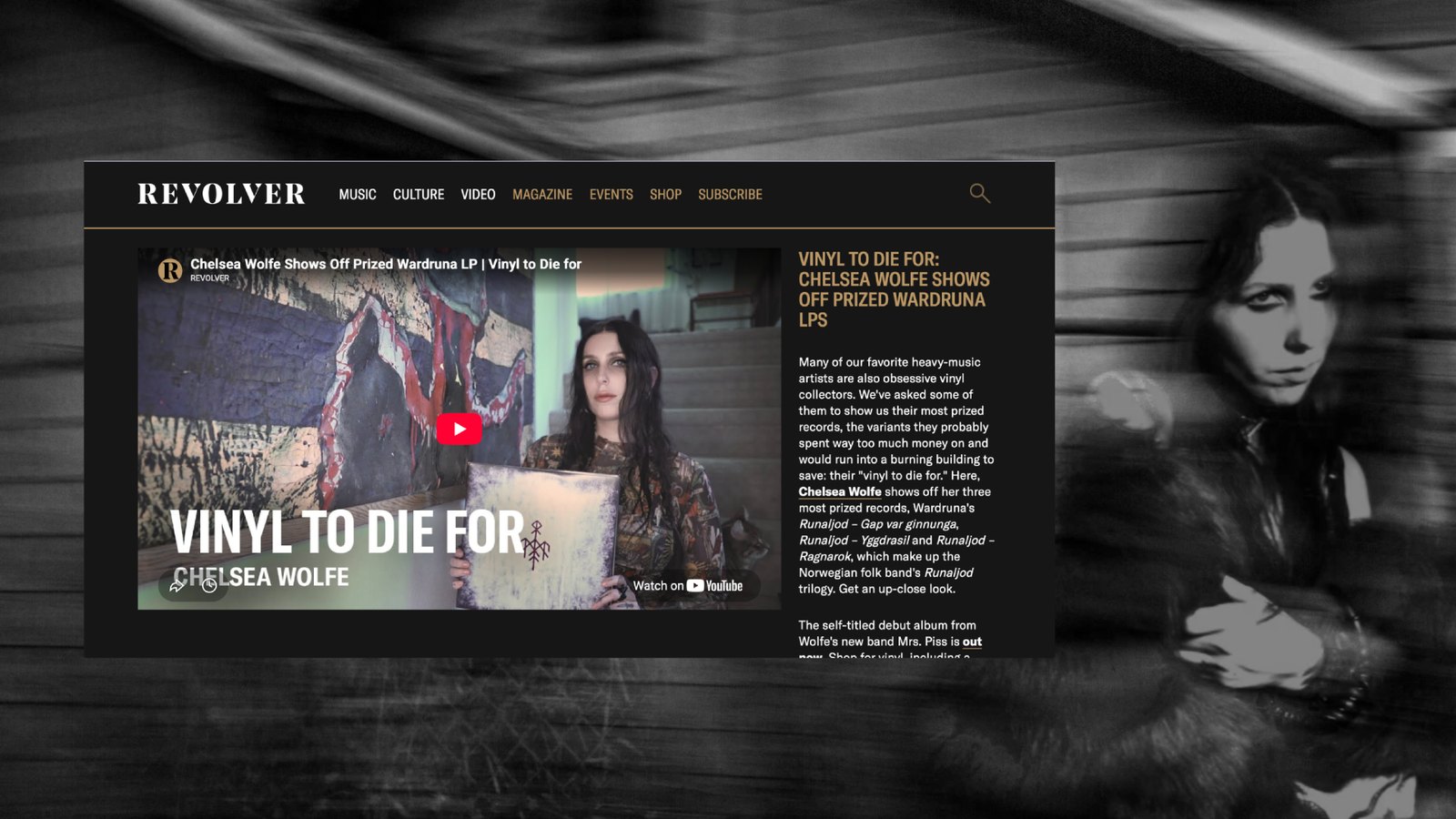
Video page — the same system in a dark treatment
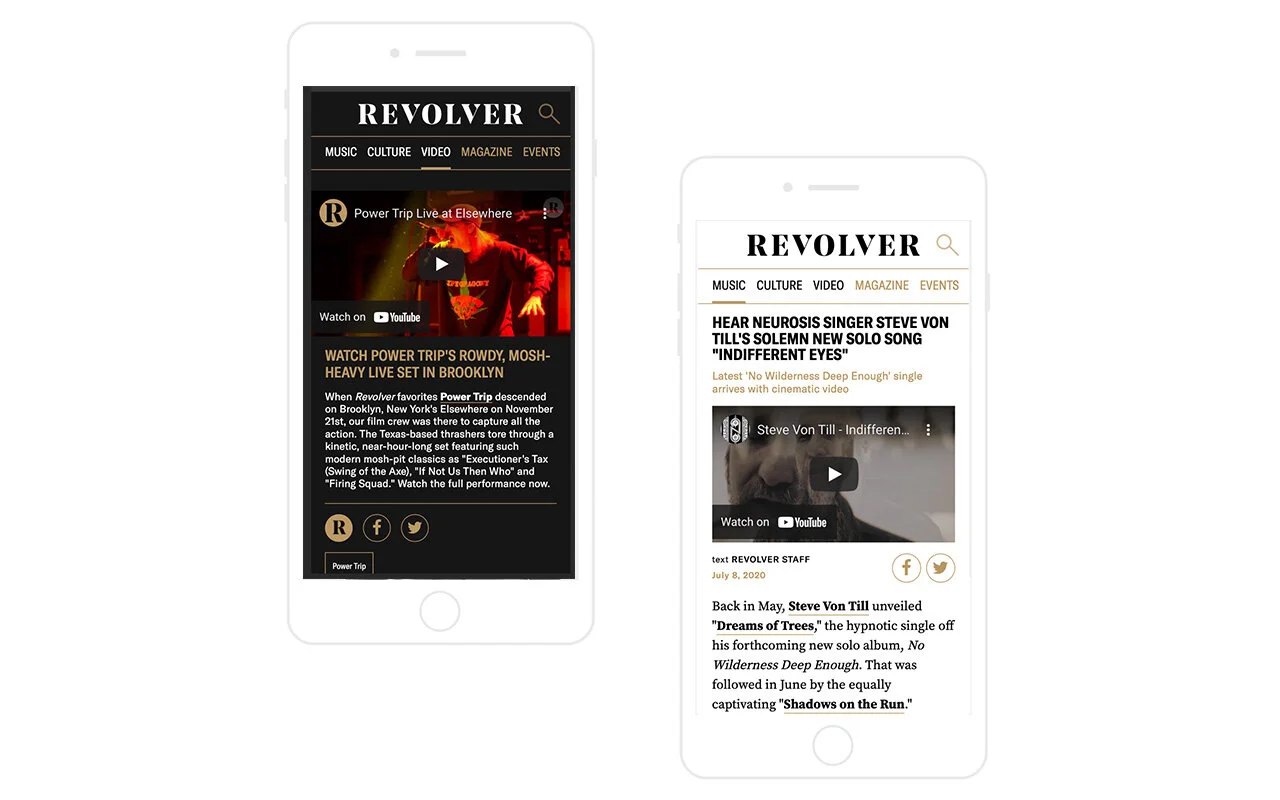
Mobile — the same template on small screens
3
Team Directed
Two designers and a developer
8 yrs
Still In Use
The 2018 template and system